


12 effective tips to enhance user interface (UI), Part 1
Do you know that user interface(UI) is actually different from web design? A good web design does not necessarily determine a good user interface (UI). A good web design might be a pleasing design that looks pretty and comfortable, but it does not mean the users can easily find the information they are looking for. User interface (UI) is about how to arrange all the front-end heavy information and data become user-friendly. They are different, but they are highly intertwined. But for sure, if a web designer claims himself a good user interface (UI), you can ask for their portfolio and try to play around with it. If you don’t know how to use it and need to check constantly with the designer, that means it’s a failed user interface (UI)
A lot of the websites have multiple functions and designs to impress users. However, from a user point of view, they just want to find the information they need. You may have the best-looking web design ever, but if the user cannot use your portal easily, they leave!
Here are 12 effective tips to help you enhance your user interface (UI).
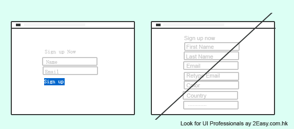
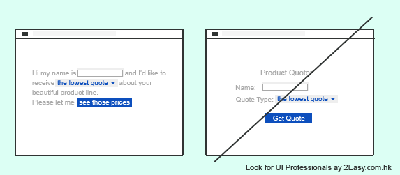
1) Less Form Fields to enhance user interface (UI)
Do you want to have a high conversion rate and ake your site easy to use? You should try to have fewer form fields as possible in order to attract users. When you decide to sign up, would you choose to fill in a simple form or a lengthy form? You would absolutely choose the shorter one. If the fields are really important and cannot be shortened, you may consider to put them after registration. Remember, simple is beauty.
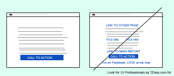
2) Keep your user’s eyeballs with your site
To have a high conversion rate, try not to put different links on your page if you want to call action from users. If the links you provide are really interesting, they leave. If the links you provide are boring, they leave. However, your objective is to call action from users. Try to eliminate the risk that those links take your users away from your site. Remove it, and keep your user’s eyeballs with you.
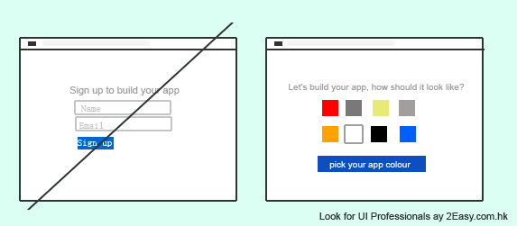
3) Arouse user’s interest to figure out your site
A good user interface (UI) should provide a high conversion rate. It is boring that every time you register, you are reaching the similar user interface (UI). If you can make it more interesting instead of an old grandma style, your conversion rate would go up. You need to engage with your users to excite them, make them feel different here rather than other one million websites they can find elsewhere. For example, by setting up some simple task or allowing users to make their own personalized features. They would be motivated and willing to figure out your site more.
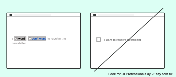
4) Opt-Out – A double edged sword
Opt-out means that you are defaulted to choose an option. The opposite of opt-out is opt-in which requires you to choose options like I agree or I do not agree. In fact, opt-out is better than opt-in because the users don’t need to take any action. On the other hand, some unethical marketers would make the options be confusing to treat users to subscribe something they don’t want. Therefore, you have to make the default options clear enough. Don’t make use of default options to treat your users.
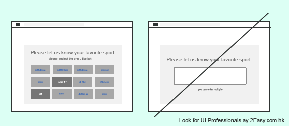
5) Asking past experience by providing choices
Recalling the memory of users is not a good way for asking past experience. Users may not remember or mix it up with other memory. Thus, they refuse to answer or provide an inaccurate answer. It would affect your conversion rate. You should try to provide choices like multiple choice question instead of open-end questions. Multiple choice questions help users to recall their memory easily.
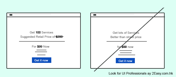
6) Selling your product/ service by anchoring
From the psychological perspective, we would feel it is cheaper if we see a higher price first. For example, a pair of trouser was selling at $800 before, but now it is selling at only $600. You would think the pair of trouser with $200 of discount is “cheaper” than it’s selling at $600. It is the same case. Actually, anchoring can be providing a greater number first instead of a higher price. It could have been the same result. If you are looking for higher conversion rate or sale, don’t remember anchoring effect – provide a greater number/ price first, then your actual selling price.
7) Starting from a small commitment first
To attract users to buy services or products, you should convince them to start from a small commitment. Breaking up a large commitment into some smaller portions significantly motivate users to use your product. For example, you can break up the annual subscription into monthly installments. The annual subscription must be more expensive than the monthly payment, users therefore, tend to be attracted to the lower price. If you are deciding to offer payment options, please try to include monthly installment as one of your options. Your conversion rate would be higher and you can charge a higher monthly installment rate.
8) Provide text with your icon button
Different users tend to have a different interpretation on icons. For example “+”, how would you interpret this button? To enlarge your window or to upload a document? Who knows. If you would like to have a good user interface (UI) and make your site easier to use, try to provide a hidden explanation next to the icon.
9) Make your text more interactive and conversational
Comparing to the standardize and boring wording, an interactive and conversational wording would be more attractive to users. Users would feel like interacting with someone although it is just a computer. With the interaction feature, users would find the site more user-friendly and tend to spend more time on the site. Your conversion rate will also increase accordingly.
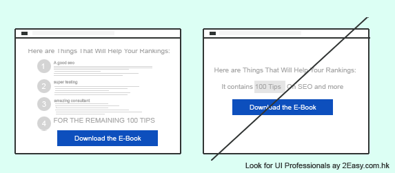
10) Let your users “stay hungry.”
Everyone has a curious mind. If you can trigger your user’s curiosity, your conversion rate will increase rapidly. Here are two different writing examples,
- “This link contains the information about Iphone6.
- You provide some information about iPhone 6, then “For the remaining information, go to this link”.
Which of the above attracts you more? Remember, if you can keep your users to stay hungry, your conversion rate would be tremendous!
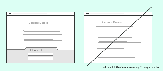
11) Drawing attention to important actions
If you have an important “Action to Call” on the page and want to draw the user’s attention, just make it sharp and different. You can try irregular lines, shapes, different color, highlights to draw user’s attention. Sometimes users are not aware of your action and miss it. Make it different and sharp can draw their attention and lead to a higher conversion rate.
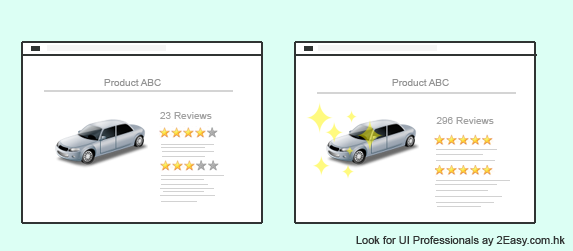
12) Sometimes you need a bad review
Would you trust a product with 100 marks and does not contain any bad review? No, it must be cheating. Therefore, little bad reviews make your products more trustworthy. Of course, your good reviews should be more than the bad one. After gaining the trust from your users, your conversion rate and sale should increase.
如閣下需要用戶介面設計(UI Design)服務,
2Easy 為你度身尋找最適合的網站設計服務提供者!
Are you looking for User Interface (UI) Design services? Search for local professional service providers and hire the best at 2Easy.
Look for Web & Mobile UI/UX Design Agencies
[showhide type=”Reference”]
Reference:
[/showhide]